In the first article in this series we looked at the history of HTML5 forms and many of the new attributes available to us. In this second and final part of the series, we’ll look at the new input types available in HTML5. As we’ll see, these new features will go a long way toward making your life easier while delivering a delightful user experience. The best thing about all this? You can start using them now.
This is article is an excerpt from Chapter 6 of Beginning HTML5 and CSS3: The Web Evolved by Christopher Murphy, Oli Studholme, Richard Clark and Divya Manian, published by Apress.
Note: As this article is a book excerpt, browser renderings of attributes and input types may have altered since the screenshots were taken. Additionally, browser support may have increased since publication so please refer to the links at the end of the article for the current state of browser support.
New input types
HTML5 introduces no less than a baker’s dozen (yes, that’s 13!) new input types for forms. We’re going to take a brief look at each of them and explain why you should be using them right now. These new input types have dual benefits: using them means less development time and an improved user experience. The new input types we’ll be looking at are:
search
Search seems like an appropriate place to start our foray into HTML5 input types. When we talk about search, we’re not just talking about Google, Bing, or Yahoo. We’re talking about the search field on that e-commerce site you just made a purchase from, on Wikipedia, and even on your personal blog. It’s probably the most common action performed on the Web every day, yet it’s not marked up very semantically, is it? We all tend to write something like this:
<input type="text" name="search">Well, what if we could write something like …
<input type="search" name="search">With HTML5 we can. Feels much better, doesn’t it? Desktop browsers will render this in a similar way to a standard text field—until you start typing, that is. At this point, a small cross appears on the right side of the field. Notice the x in Figure 1. This lets you quickly clear the field, just like Safari’s built-in search field.

type="search" as displayed in Safari for WindowsOn a mobile device, however, things start to get interesting. Take the example iPhone shown in Figure 2; when you focus on an input using type="search", notice the keyboard, specifically the action button on the keyboard (bottom right). Did you spot that it says “Search” rather than the regular “Go”? It’s a subtle difference that most users won’t even notice, but those who do will afford themselves a wry smile.

type="search" on the iPhoneAs you’ve seen with the new attributes, browsers that don’t understand them will simply degrade gracefully. The same applies to all of the new input types discussed here. If a browser doesn’t understand type="search", it will default to type="text". This means you’re not losing anything. In fact, you’re using progressive enhancement and helping users to have a better experience. Let’s face it: filling out web forms isn’t very fun, so anything you can add to ensure a smoother experience, the better.
In rendering terms, the email input type is no different than a standard text input type and allows for one or more e-mail addresses to be entered. Combined with the required attribute, the browser is then able to look for patterns to ensure a valid e-mail address has been entered. Naturally, this checking is rudimentary, perhaps looking for an @ character or a period (.) and not allowing spaces. Opera 9.5+, Firefox 4+, Internet Explorer 10 and Chrome 5+ have already implemented this basic validation. The browser goes as far as presenting the user with an error message (see Opera in Figure 3) if the e-mail address entered isn’t valid. You can style the field for when an value is entered using the :valid, :invalid or :required pseudo class (assuming you have the required attribute on the input) just like Locum Dr. Peter explained.
<input type="email" name="email" required>
The specification details that one or more e-mail addresses are allowed. This means that the multiple attribute could be used with type="email" too.
Pretty cool, huh? Again, this highlights how HTML5 forms help to cut down the amount of JavaScript that you have to write when carrying out form validation.
There’s always a catch, though, right? At the time of writing, there is an internationalization issue with type="email". When using it with double-byte internationalized domain names, the browsers invalidate them; so this example
<input type="email" name="email" value="gordo@日本.jp">isn’t valid in Firefox, Safari, or Chrome (there is no issue in Opera). However, a workaround has been created by Kyle Barrow that uses type="text" with the pattern attribute, as shown here:
<input type="text" name="email" value="gordo@日本.jp" pattern="[^ @]*@[^ @]*">An alternative solution is to continue using type="email" with the formnovalidate attribute on the submit button, as follows. This ensures that no validation will be carried out on form submission, which may or may not be suitable for your needs.
<form action="process.php"> <label for="email">Email:</label> <input type="email" name="email" value="gordo@日本.jp"> <input type="submit" formnovalidate value="Submit"> Or you could use the novalidate attribute on your form, like so: <form action="process.php" novalidate> <label for="email">Email:</label> <input type="email" name="email" value="gordo@日本.jp"> <input type="submit" value="Submit">Internationalization issues aside, remember how we said there are dual benefits to HTML5′s input types—less development time and better user experience? Let’s go back and look at the iPhone once more, as shown in Figure 4.

Did you notice it this time? No? Look at the keyboard again. That’s right, the keyboard is different. There are dedicated keys for the @ and . characters to help you complete the field more efficiently. As we discussed with type="search", there is no downside to using type="email" right now. If a browser doesn’t support it, it will degrade to type="text". And in some browsers, users will get a helping hand.
url
The url input type, as you might expect, is for web addresses. You can use the multiple attribute to enter more than one URL. Like type="email", a browser will carry out simple validation on these fields and present an error message on form submission. This is likely to include looking for forward slashes, periods, and spaces, and possibly detecting a valid top-level domain (such as .com or .co.uk). Use the url input type like so:
<input type="url" name="url" required>Again, we’ll take a look at how the iPhone renders type="url". As you can see in Figure 5, it has again updated the onscreen keyboard to ensure that completing the field is as simple as possible for the user by swapping the default space key for period, forward slash, and .com keys. (To access more endings like .org and .net, tap and hold the .com key.)

tel
tel differs from email and url in that no particular syntax is enforced. Phone numbers differ around the world, making it difficult to guarantee any type of specific notation except for allowing only numbers and perhaps a + symbol to be entered. It’s possible that you can validate specific phone numbers (if you can guarantee the format) using client-side validation. type="tel" is marked up as follows:
<input type="tel" name="tel" id="tel" required>Once more, the iPhone recognises type="tel", only this time it goes one step further and completely changes the keyboard to the standard phone keyboard, as shown on the left in Figure 6. In addition to the iPhone, some Android devices (such as HTC Desire, shown on the right in Figure 6) also display a numeric keyboard for type="tel". That’s pretty handy, don’t you think? Nice, big keys for entering a phone number help you to get that big, nasty form completed quickly.

type="tel" on the iPhone and some Android devices dynamically changes the keyboard to a numeric keypad. (Android screenshot provided by Stuart Langridge).number
number, as you might expect, is used for specifying a numerical value. As with the majority of these new input types, Opera was the first to implement type="number". It, Safari, and Chrome render the input as a spinbox control (see Figure 7) whereby you can click the arrows to move up or down. Or if you prefer, you can type directly into the field. Firefox, on the other hand, renders the field like a standard text box. Support for type=”number” is in IE 10 also, although if you enter a non-numerical character the field empties when focus is lost and no feedback is provided to the user.
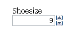
type="number" in OperaWith the additional attributes min, max, and step we can change the default step value of this spinbox control as well as set minimum, maximum, and starting values (using the standard HTML value attribute). This example shows how these attributes work:
<input type="number" min="5" max="18" step="0.5" value="9" name="shoe-size">In this example, min represents the minimum value the field will accept, and max represents the maximum value. If we reach the maximum or minimum value, the appropriate arrow on the spinbox control will be greyed out so you can no longer interact with it. step is the increment that the value should adjust up or down, with the default step value being 1. This means we can include negative values or step up in increments of 0.5 or 5. value is that attribute you’re used to from previous versions of HTML. Each of the attributes are optional, with defaults being set if they aren’t used.
In contrast to Opera’s implementation, the iPhone (Figure 8) and some Android devices (such as HTC Desire, shown on the right in Figure 6-13) simply render the field as a standard text box but optimize the keyboard for easy input.

type="number" on iPhone and Android HTC Desire (Android screenshot provided by Stuart Langridge)To make the iPhone render with the standard telephone keypad as we saw for type="text" Chris Coyier, of CSS Tricks devised a little hoax you can use. Rather than using type=”number”, use a standard type="text" input and add a pattern attribute that accepts only numbers, as shown below. This solution isn’t ideal but if you think it could be useful, Chris has put a short video together showing it in action.
<input type="text" pattern="[0-9]*" name="shoe-size">Chris’ technique may soon become absolete though with the introduction of the inputmode attribute. The attribute, recently added to the specification will allow users to specify the type of input mechanism that is most useful for users. When implemented, you will be able to choose between numeric, latin, email, or kana input modes.
range
The range input type is similar to number but more specific. It represents a numerical value within a given range. Why the difference, I hear you cry? Because when you’re using range, the exact value isn’t important. It also allows browsers to offer a simpler control than for number. In Opera, Safari, Internet Explorer 10 and Chrome, type="range" renders as a slider (see Figure 6-14). When moving the slider in IE 10 a tooltip appears showing the current value. Additionally, in Opera, if the CSS defines the height greater than the width, the slider control will be rendered vertically as opposed to the standard horizontal rendering.
The following code shows how we might mark up our skill level on a scale of 1 to 100 by setting the min and max attributes (see Figure 9). We can also set the starting point for range using the value attribute.
<input id="skill" type="range" min="1" max="100" value="0">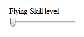
type="range" in ChromeDates and times
If you’ve ever booked tickets online, you will have come across date pickers to help you quickly and easily choose the date you require. Perhaps you’ve even implemented a date picker on your own website. Generally, this is done using a JavaScript library such as jQuery, Dojo, or YUI. It can be a pain when you need to load a whole library and associated plug-ins just to implement a simple date picker. Well, with HTML5 we get that functionality baked into the browser. Not only that, but we don’t have to stop at just electing a single date; we can select a week, month, time, date and time, and even date and time with a time zone using the different input types. The markup is pretty straightforward.
<input id="dob" name="dob" type="date">You can go a step further by using the min and max attributes to ensure the user can only choose from a specified date range.
<input id="startdate" name="startdate" min="2012-01-01" max="2013-01-01" type="date">As with many of the other form implementations, Opera leads the way (support in other browsers is varied). Let’s take a look next at how browsers render these input types.
date
Figure 10 shows Opera 10.5′s rendering of type="date".

type="date" in Opera 10.5These date pickers aren’t restricted to desktop devices; some Blackberry devices and Chrome for Android render its internal date picker when used with type="date" (see Figure 11).

type="date" on Blackberry (screenshot provided by Terence Eden)month
Next up, Figure 12 shows type="month", which might, for example, be used for a credit card expiry date.
<input id="expiry" name="expiry" type="month" required>
type="month" in Opera 10.5week
You can also drill down to type="week". Notice how Opera highlights a specific week using the same date picker control, as shown in Figure 13.
<input id="vacation" name="vacation" type="week">
type="week" in Opera 10.5time
You can see in Figure 14 that type="time" renders a spinbox similar to that used earlier for selecting the precise time.
<input id="exit-time" name="exit-time" type="time">
type="time" in Opera 10.5datetime
We can combine the date and time by using type="datetime" for specifying a precise time on a given day, as shown in Figure 15.
<input id="entry-day-time" name="entry-day-time" type="datetime">
type="datetime" in Opera 10.5datetime-local
Finally, Figure 16 shows that we can achieve slightly more granular control by selecting a precise time on a given day with a local time zone variation using type="datetime-local".
<input id="arrival-time" name="arrival-time " type="datetime-local">
type="datetime-local" in Opera 10.5Date and time caveats
There are two caveats with these implementations. First, with the current implementation, it isn’t possible to type a date into the field (in all browsers). The date picker is keyboard accessible, though. However, we can foresee a potential issue; if implemented on a form that a data entry clerk regularly completes, they are likely to be quicker at typing the date than tabbing through with the keyboard or selecting from a date picker. Second, it isn’t possible to style the look of the date picker. We tend to think that this is a good thing, as users will receive a common experience across all websites they visit (provided they use the same browser all the time). Undoubtedly, though, corporations will require a branded date picker. Safari 5 and Chrome 5 have implemented these input types, but, unfortunately, they aren’t very user friendly. Dates have to be entered in the same format as the time element that we met earlier in the book. So for dates, the format would be YYYY-MM-DD, and for dates with time, a user would have to enter YYYYMM-DDT00:00Z, which is not very friendly at all.
As with the other new input types, if a browser doesn’t recognize them, it will simply default back to type="text" and let the user continue to use your JavaScript date picker.
color
The color input type is pretty self-explanatory: it allows the user to select a color and returns the hex value for that color. It is anticipated that users will either be able to type the value or select from a color picker, which will either be native to the operating system or a browser’s own implementation. Opera 11 has implemented type=”color” with a simple color picker that offers a number of standard color choices or the option to select Other, which brings up the operating system color picker (shown on the right in Figure 17).
<input id="color" name="color" type="color">
type="color" in Opera on the left and the result of clicking Other shown on the rightIn contrast, certain Blackberry devices have implemented the color input type that renders a color picker, as shown in Figure 18.

type="color" on Blackberry (screenshot provided by Terence Eden)Input types summary
By using HTML5′s new form input types right now, we can enhance the user’s experience, future-proof our site, and make our life as developers easier. Obviously, we can’t just leave the browsers that don’t support all these new features hanging, and in Chapter 6 of Beginning HTML5 and CSS3 we take a look at how to detect support for these form features using JavaScript.
You can find a dummy form, using some of the examples we’ve shown in this article at our HTML5 forms demo page.
We’ve hinted throughout the article at which browsers have support for HTML5 forms input types and attributes. With new versions of browsers being released at an ever-increasing rate, it can be difficult to keep up with what is or isn’t supported. If you want to keep an eye on the current progress, we suggest visiting When can I use … or FindMeByIP or Wufoo’s HTML5 forms research.
If you missed the first article in this series on HTML5 forms, why not read a brief History of HTML5 forms and learn all about the new attributes introduced.
 This is article is an excerpt from Chapter 6 of Beginning HTML5 and CSS3: The Web Evolved by Christopher Murphy, Oli Studholme, Richard Clark and Divya Manian, published by Apress.
HTML5 forms input types originally appeared on HTML5 Doctor on February 28, 2013.
[plinker]